Movement design · 2020
Aurat Azadi March.
A visual campaign for a grassroots feminist movement in Islamabad — carrying the demands of equality, justice, and systemic change from screens to streets.
- Role
- Lead designer
- Context
- Grassroots feminist movement · Islamabad, Pakistan
- Duration
- 2020
- Collaborators
- Organisers, participants, and volunteers
Overview
A campaign for one of Pakistan's most urgent movements.
In 2020, I was the lead designer for the Aurat Azadi March in Islamabad, a grassroots feminist mobilisation confronting Pakistan's severe gender inequality. Pakistan continues to rank among the lowest countries on the Gender Parity Index, with systemic barriers to education, healthcare, and workplace participation, alongside pervasive gender-based violence. The march exists inside that urgency.
My role was to build a visual campaign that could carry the movement's demands — equality, justice, and systemic change — across posters, banners, and social media, without flattening the plurality of voices behind them.
Approach
Design rooted in the voices of the women I worked with.
The design process was deeply collaborative. I worked closely with organisers and participants to understand their experiences, their language, and what the movement was trying to say — not in the abstract, but in specific words and refusals.
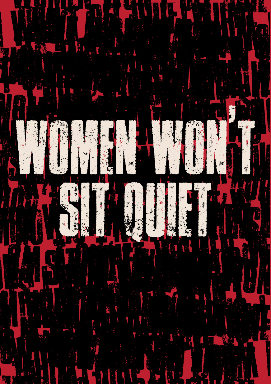
From those conversations, I built a bold visual language using striking typography and imagery to hold both the passion and the urgency of the moment. The palette of red, white, and black carried the emotional register of the campaign: red for passion and resistance, white for hope and unity, and black for the gravity of the struggle.
Process
From listening to streets.
- 01
Listening to organisers and participants
The campaign began in conversation with the women leading the march. Their words, refusals, and demands became the source material for every visual decision that followed.
- 02
Building a visual vocabulary
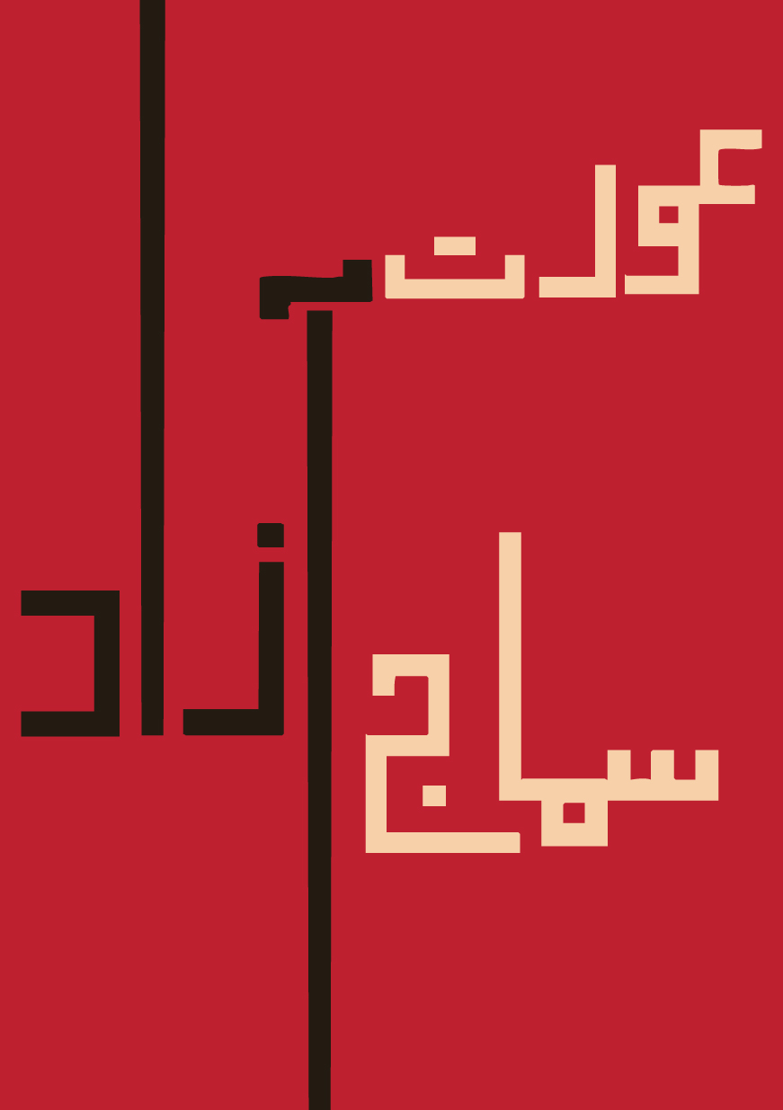
I explored bold typography, gaze, gesture, and Urdu calligraphy as ways to hold both political weight and emotional intimacy. Sketches moved between English and Urdu without hierarchy.
- 03
A colour palette with intent
Red for passion and resistance, white for hope and unity, black for the gravity of the struggle. The palette carried across posters, banners, and social tiles so the movement felt unmistakably its own.
- 04
Iteration with the collective
Every draft was shared back with organisers and participants. Feedback shaped the language, the imagery, and what was kept, softened, or made louder.
- 05
From screens to streets
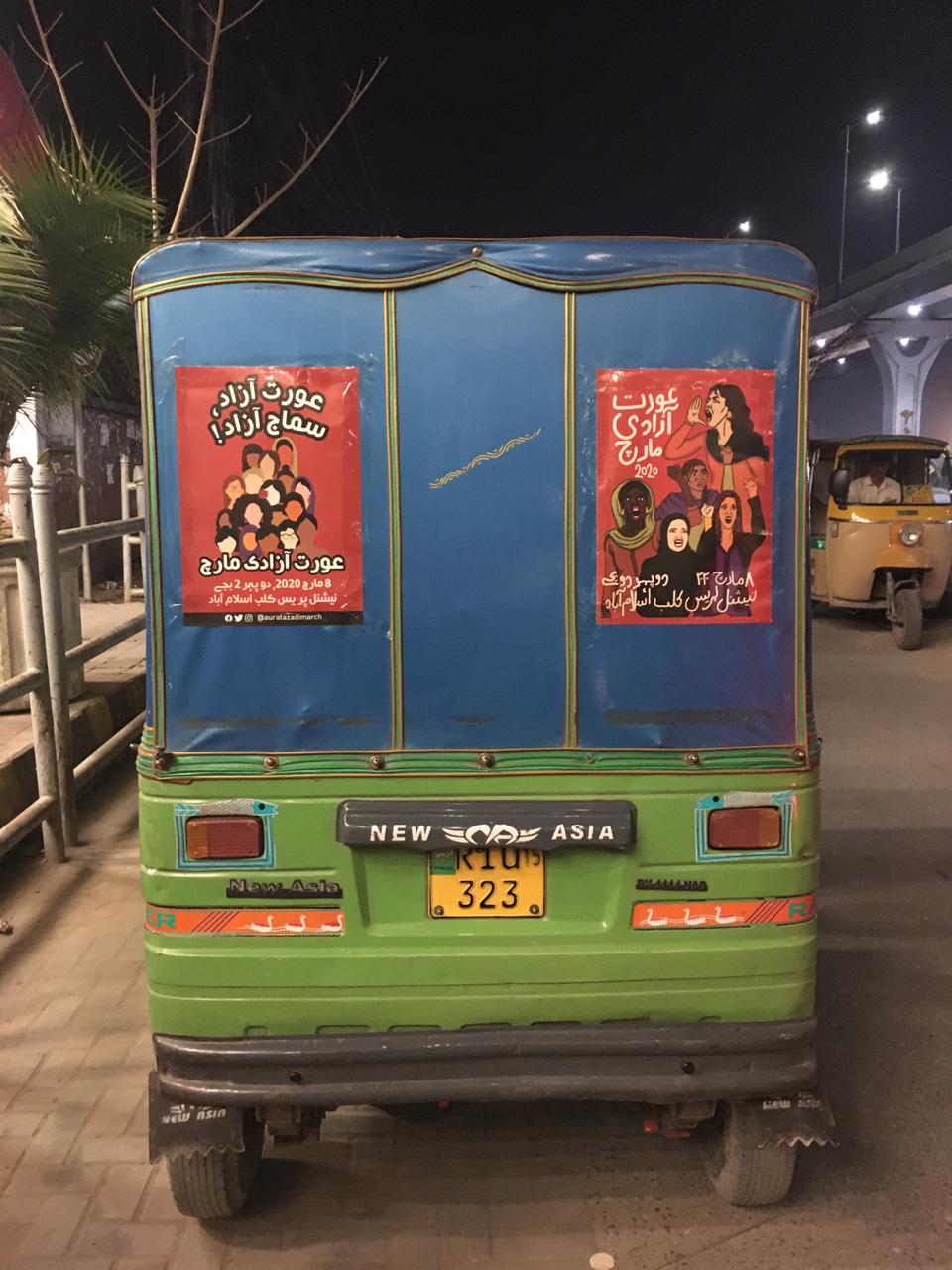
The final visuals lived across placards, walls, social feeds, rickshaws, and bodies. Design travelled with the people carrying it, not just the platforms distributing it.
Campaign visuals
A visual vocabulary of gaze, gesture, and word.
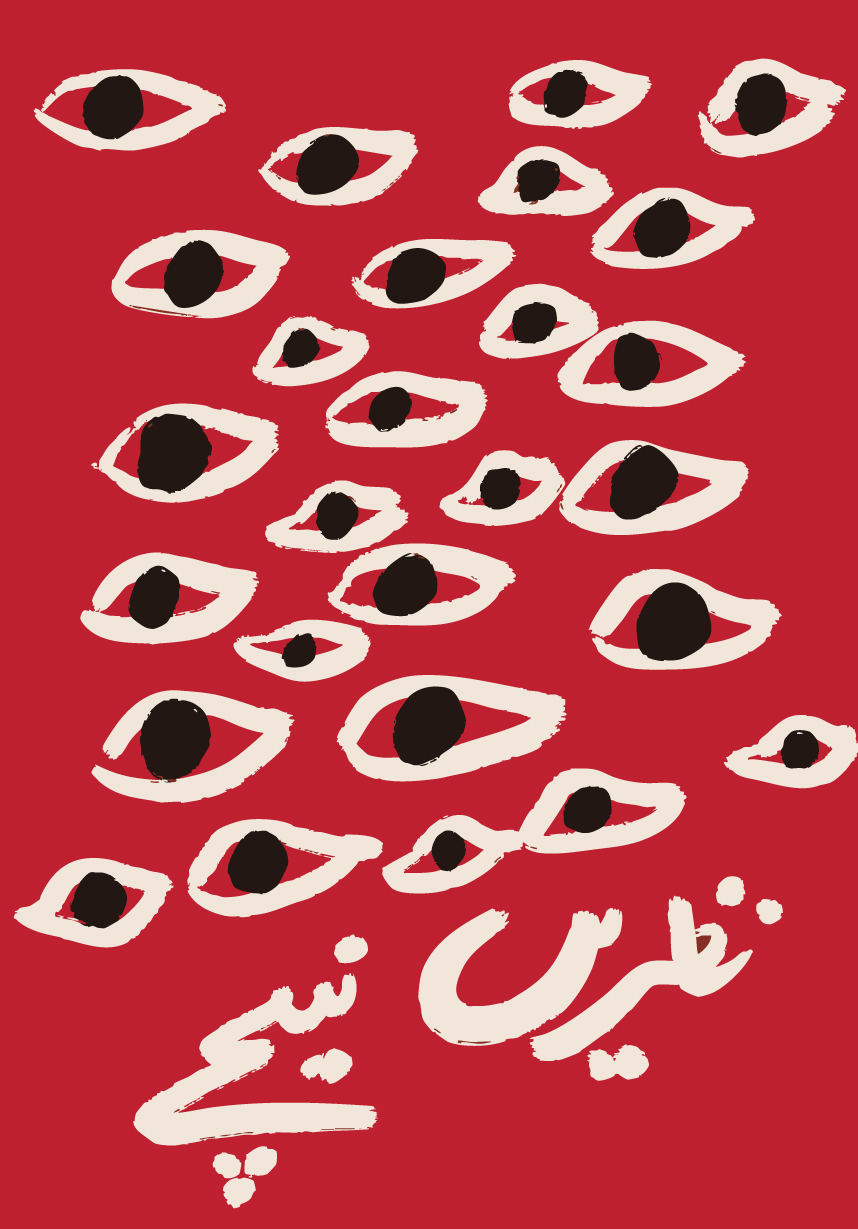
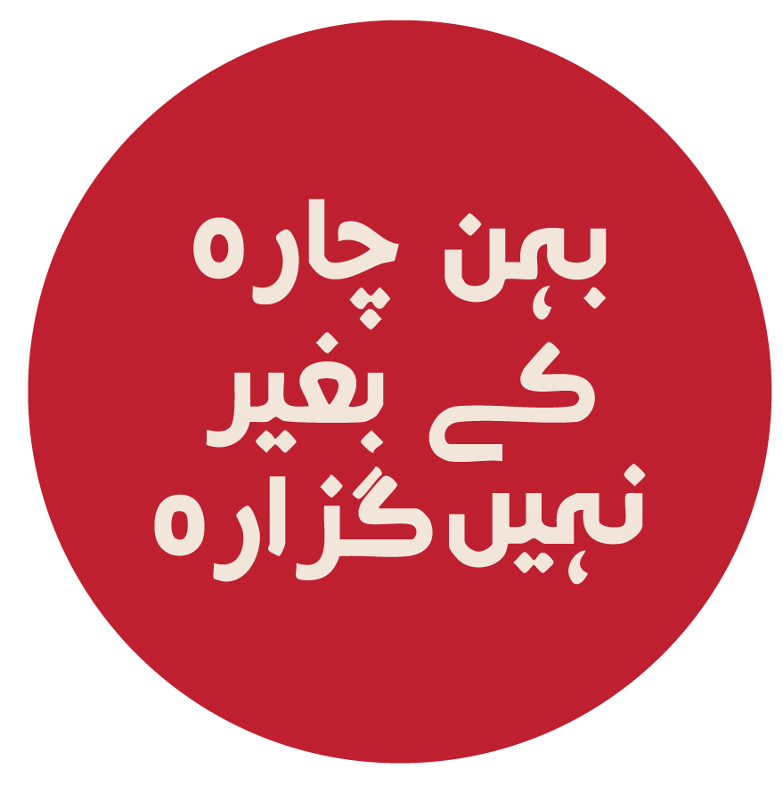
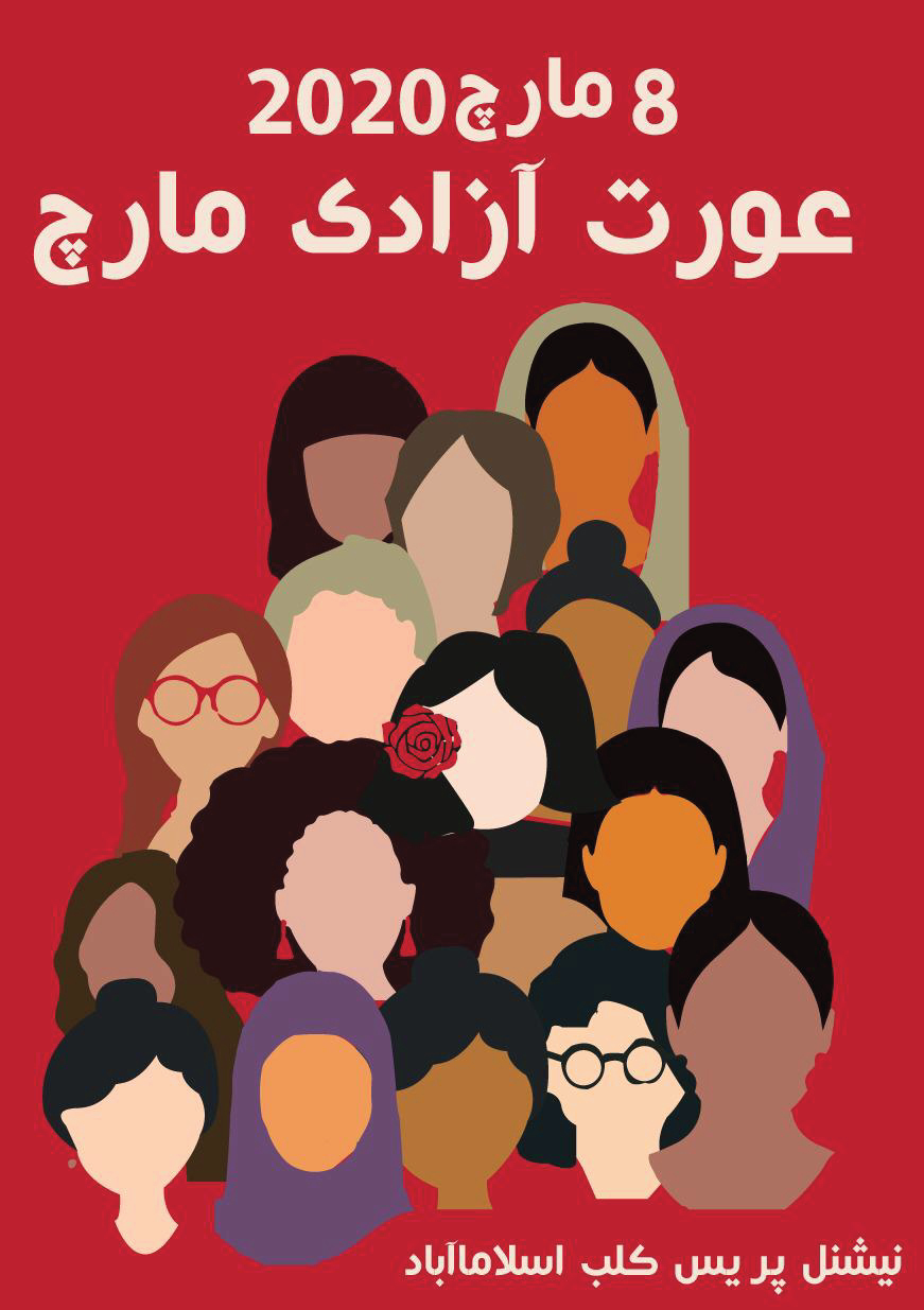
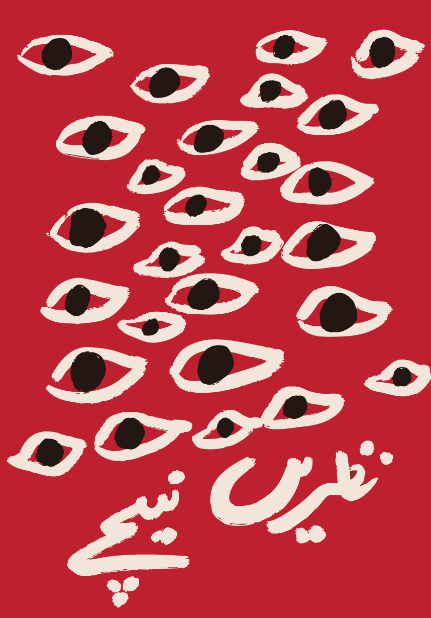
Posters and social pieces built around bold Urdu and English typography, protest photography, and a shared palette that made the movement instantly recognisable.
On the ground
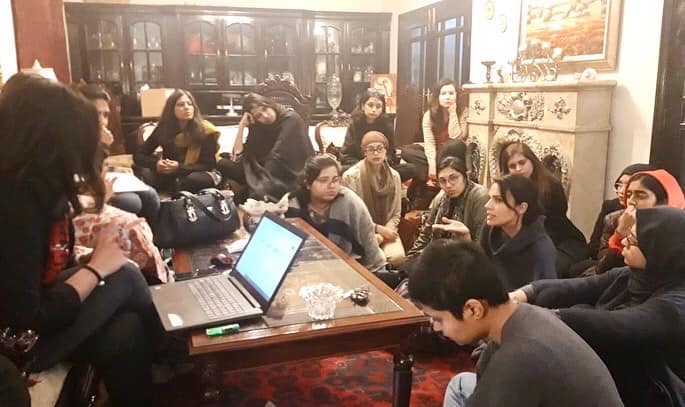
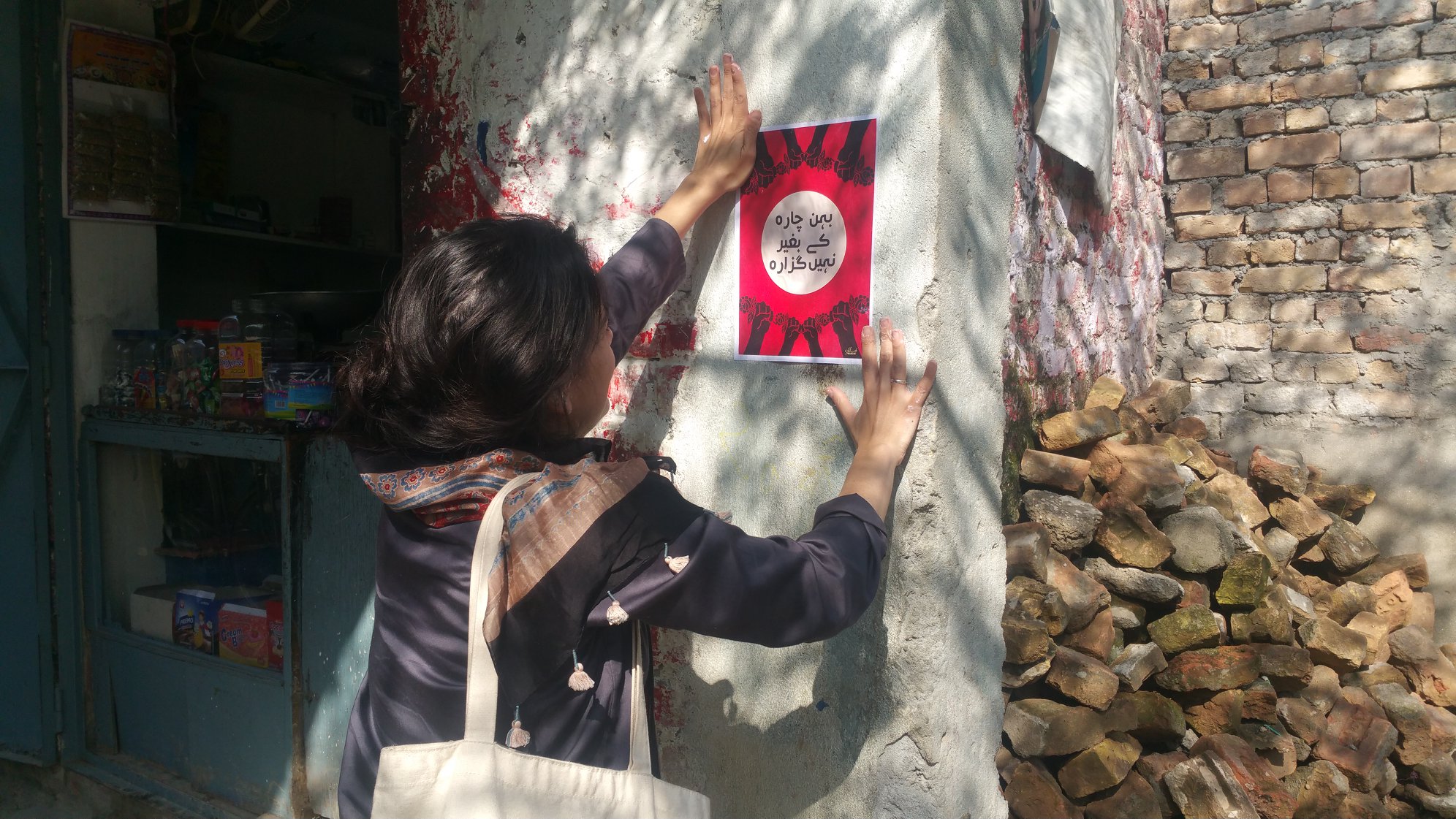
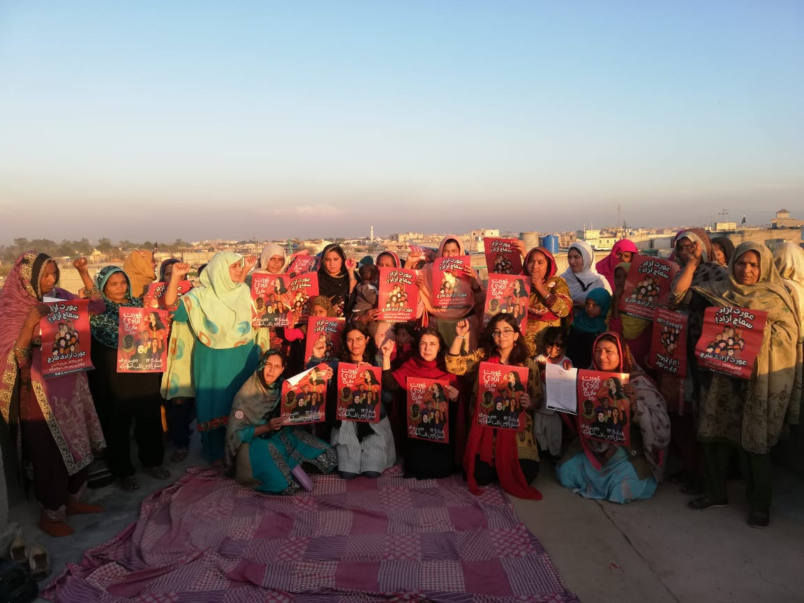
The campaign lived in rooms, on walls, and on the back of a rickshaw.
Design here was collective labour. Placards made together on the floor. Posters pasted in neighbourhood shops. Materials carried by the women mobilising in their own communities.
Outcome
A shared visual language for a mass movement.
The campaign supported mass mobilisation while holding the complexity of the lived experiences behind it. It travelled across placards, walls, screens, and bodies, and became part of how the march was recognised in public memory.
More than a visual identity, it was a way of making the movement's demands legible without flattening them — balancing aesthetic clarity with political weight so the call for gender equality and justice in Pakistan could be heard on its own terms.
Reflection
What this work taught me.
Designing for a movement is not the same as designing for a brand. The work belongs to the people carrying it, and the designer's job is to listen carefully enough that the visuals feel like an extension of their voices rather than a wrapper around them. Aurat Azadi March shaped how I now think about design as a political practice — one that is accountable to the communities it serves, and one that has to be built with them, not for them.